DESIGN RULES
To design is to plan. To problem solve. The process of bringing order from chaos and randomness. It is the process of looking for and showing off the similarities and differences inherent in the content of visual message.
Designers struggle to reveal the meaning of their messages by using type, imagery, and space. If used well, the meaning is illuminated and the process of communication is well-served.
- Define the problem you're given.
- Know the material. Digest it fully. Make a thought map of it.
- Distill the essential from the mass of confusing muchness. Nothing may be missing, nothing may be extraneous. This is the definition of elegance.
- Abstract the main point so its importance to the reader is clear and it is visually arresting. A message that doesn't stop readers won't be read.
- Unify all elements so they don't outshout each other.
- Society has not improved the landscape by overfilling it with constructions. Neither does a designer improve a page by overfilling it with content.
SPACE
"I fill up a place, which may be better....when I have made it empty." — Shakespeare
- Space attracts readers.
- Space is created when a figure is placed in it.
- Space is context.
- Space must look deliberately used.
- Space adds quality.
- Space adds functionality.

- Graphic emptiness can be made to look vast and unending or it can be manipulated to look finite and segmented.
- Placing an object in space creates a figure/ground relationship.
Figure/Ground
Stable figure / ground relationship: Forms are seen in unchanging relationship of having been placed in front of their background. Balancing the sizes and shapes of the figure and ground activates both and makes it difficult to tell which is in front of the other, creating a unified design.

Reversible figure / ground relationship: Figure and ground can be seen equally. The figure and ground interpenetrate. A balanced figure/ground relationship creates tension where one threatens to overwhelm the other.

Ambiguous figure / ground relationship: Elements may be in both foreground and background simultaneously. White space doesn't literally have to be white. It can be black or any other color. It just has to take on the role of emptiness.
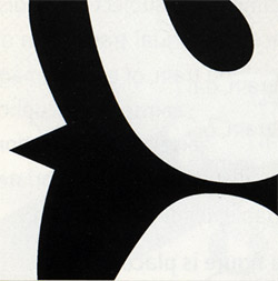
...Space is context:

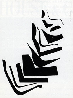
SYMMETRY & ASYMMETRY
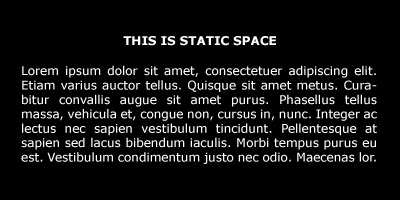
- symmetry = passive space
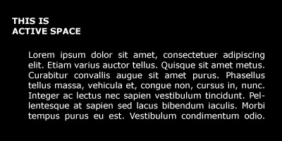
- asymmetry = active space
- Active space can imply motion
Design is the arrangement of shapes. All design elements have a shape, which is an area defined by a perimeter.
White space is like digital data --- it is either "on" or "off". If it is "on", it is active --- the shape is of approximately equal importance as the positive shapes (that's a good thing!). If the white space is "off", its shape is essentially a result of chance. It's not as interesting and can be conceived as "wasted space."
STATIC SPACE:
ACTIVE SPACE:
Rule of CLOSURE // motion in active space

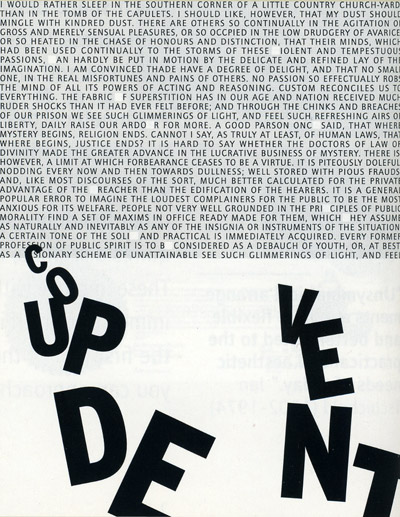
EMPTY SPACE:
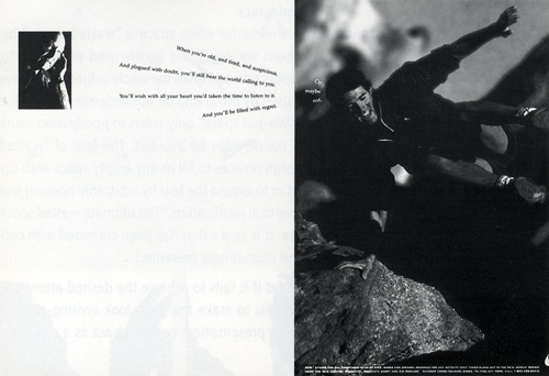
Ideas that empty space can signify:
- Quality: extravagance, class, wealth, luxury, exclusivity
- Solitude: abandonment, loneliness
- Missing: lost, stolen, misplaced
- Clean: bleached, washed
- Purity: unsullied, unadultured, virgin, unbuilt
- Heaven: absolution, sacredness
- Abundance: plenty
- Openness: distance, acreage, infinity
- Calmness: placidity, undisturbed, inaction"
- Ice: snow, sky, day, milk, marble, river, land/water
UNITY & SPACE
"Unity contributes orderliness and coherency and a civilized state of things generally, whereas the contrast family are all savages, more or less."
William A. Dwiggins (inventor of the term "graphic designer!")
One Goal of design is to create unity or harmony. Design is the organization of all the parts into a unified whole.
Dramatic contrasts, scrupulous similarity, active white space, and a great idea are the primary attributes of well-designed entities.
Image and type must share more than mere proximity. Their forms should be similar. The strongest unity is when their meanings are fused:
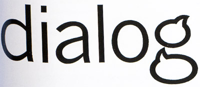
Creating contrast provides an anomaly, a focal point:

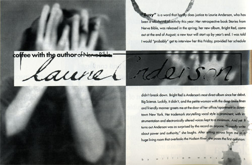
5 ways to develop an environment of similarity:
- Keep it simple and eliminate clutter (standardize column widths)
- Build in a unique internal organization by using an unusual or eccentric grid system.
- Images and type are inherently different languages. Manipulate their shapes to create design unity.
- Express continuity from page to page and issue to issue.
- Develop a manual style and stick with your format.
Contrast pairings:
SPACE filled : emptyactive : passive advancing : receding near: far 2-D : 3D contained: unrestricted |
POSITION top : bottomhigh : low right : left above : below in front : behind rhythmic : random isolated : grouped nearby : distant centered : off center aligned : independent in : out |
FORM simple : complexbeautiful : ugly abstract : representational distinct : ambiguous geometric : organic rectilinear : curvilinear symmetrical : asymmetrical whole : broken |
STRUCTURE organized : chaoticaligned : freely placed serif : sans serif mechanical : hand drawn |
COLOR black : colorlight : dark warm : cool bright : dull organic : artificial saturated : neutral |
SIZE big : littlelong : short wide : narrow expanded : condensed deep : shallow |
DIRECTION vertical : horizontalperpendicular : diagonal forward : backward stability : movement converging : diverging clockwise : counterclockwise convex : concave roman : italic |
GRAVITY light : heavystable : unstable |
TEXTURE fine : coursesmooth : rough reflective : matte slippery : sticky sharp : dull fuzzy : bald |
DENSITY transparent : opaquethick : thin liquid : solid |
Every contrast pairing is an opportunity for similarity and unity.
SEVEN DESIGN COMPONENTS:
- Unity
- Gestalt
- Space
- Dominance
- Hierarchy
- Balance
- Color
UNITY:
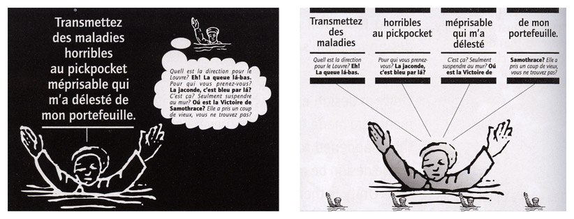
Unity exists when all elements are in agreement.Proximity:

Repetition:
GESTALT:
Each part of a design is affected by what surrounds it, By manipulating the interaction of the individual parts, you affect the cumulative perception of it. Gestalt is the over-all quality being described when you say, "This design works!"
This is all manipulated/achieved with the figure/ground relationships, the completion or "closure" of parts, and continuation -- wherein the eye follows a path, whether real or implied:

SPACE:
Consideration of white space in relation to the other design elements.
DOMINANCE:
Dominance is closely related to contrast, since there must be contrast for one element to dominate another. Dominance is created by contrasting size, positioning, color, style, or shape.
HEIRARCHY:
The best design moves the viewer across the page in order of type and images' significance.
BALANCE:
Balance, or equilibrium, is the state of equalized tension. It is not necessarily a state of calm. The three types of balance are: Symmetrical, Asymmetrical, or "overall" balance. This is usually the result of too much being forced on a page. Overall balance lacks hierarchy and meaningful contrast. Often looks noisy.
COLOR:
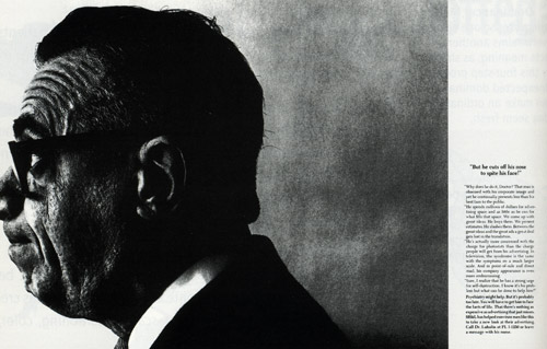
- Color gives emphasis.
- Darker type is seen first, so display type is usually bolder and bigger.
- Color highlights elements of importance.
- Color is partly artistry, but mostly science and common sense.
- Plan color use from the start. If it is added on at the end, its use is most likely to be only cosmetic.
- Color codes information, simplifying complex data.
- People gravitate to whatever looks different on a page.
- Colors are either warmer or cooler. Warm colors move elements forward (red / yellow) while cool colors move elements back (blue / green).
Marshal McLuhan's ("The medium is the message") three-level
"hierarchy of communication":
Words
Symbols
C o n s c i o u s n e s s
Color
Color is at the bottom, functioning in the viewer's subconscious.
Colors have particular associations (certain contexts may change these, but in general...):
BLUE = DIGNIFIED
GREEN = PERSISTENT
RED = ASSERTIVE
YELLOW = OPTIMISTIC (yellow = optimistic)
BROWN = PASSIVE
VIOLET = MEDITATIVE
BLACK = SURRENDER
GRAY = BARRIER
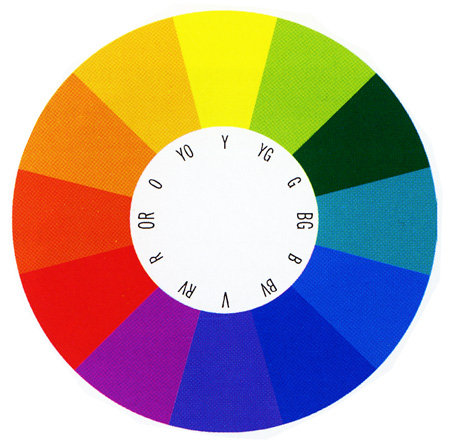
Complimentary Colors are opposite |
Analogous colors are next to each other on the color wheel |
||||